
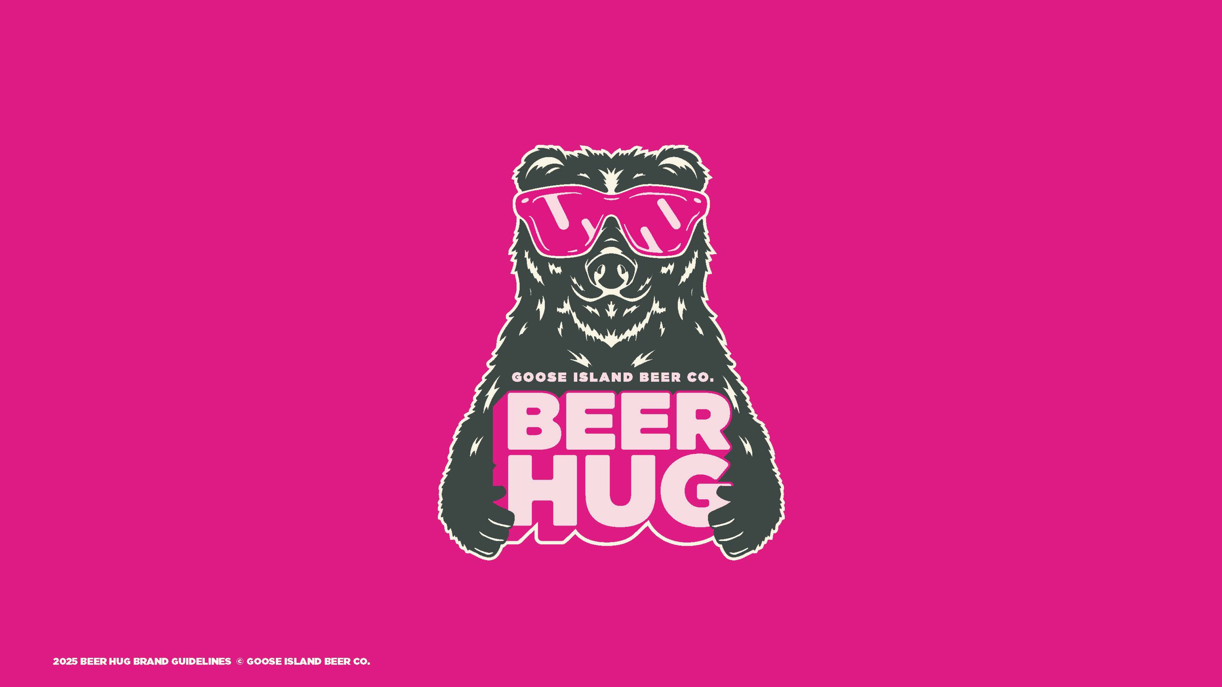
Goose Island Beer Hug
What We Did
Brand Optimization
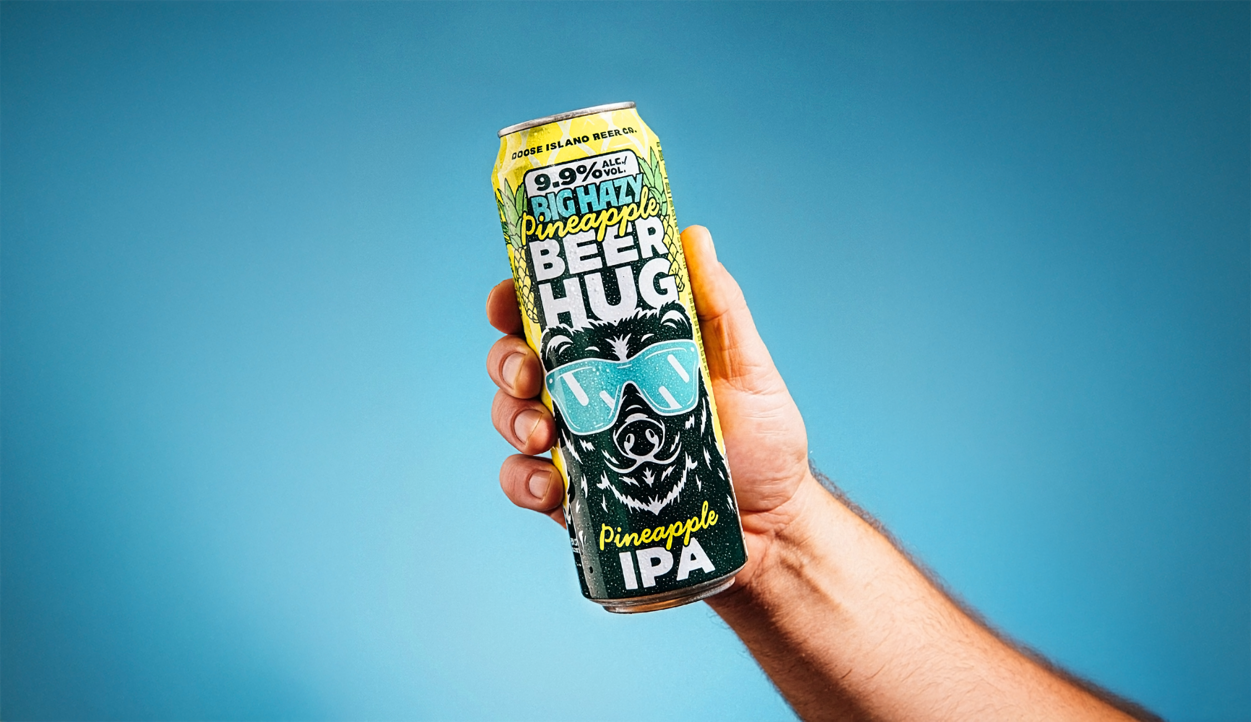
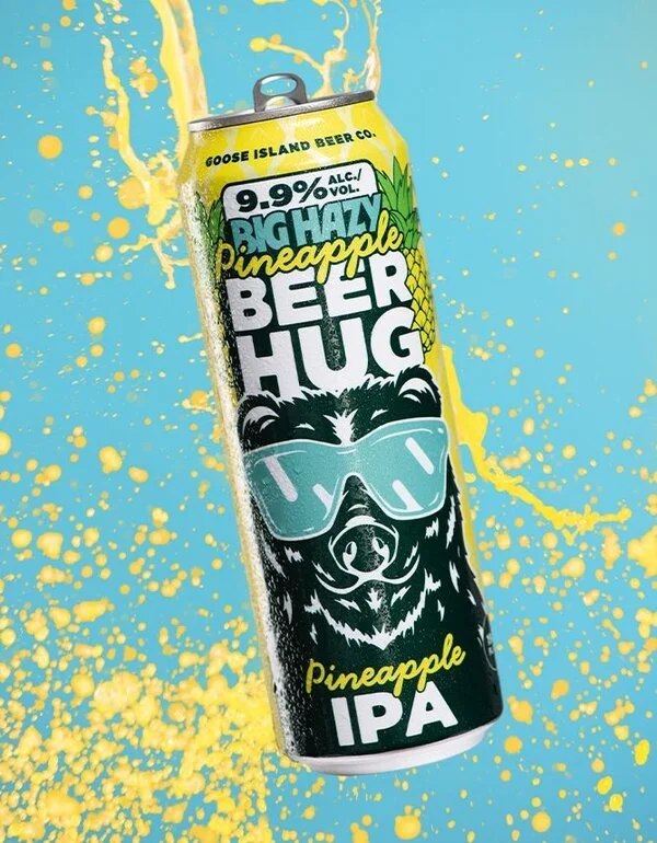
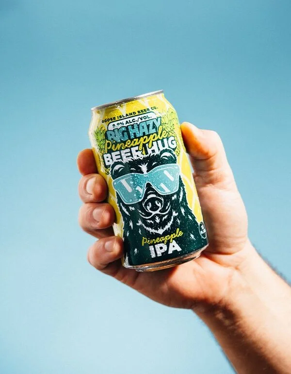
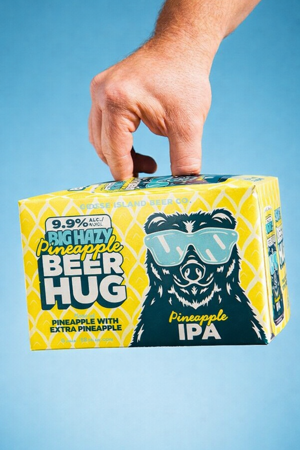
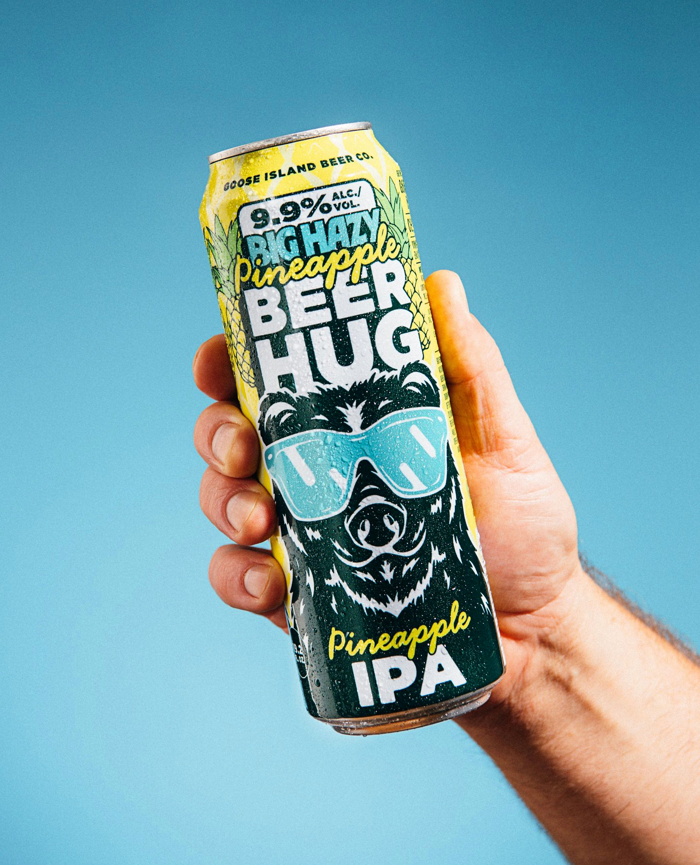
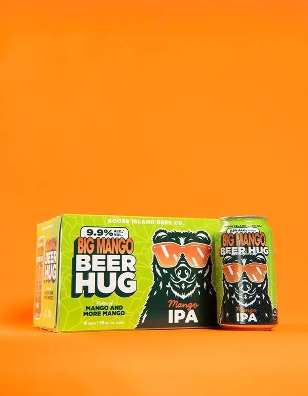
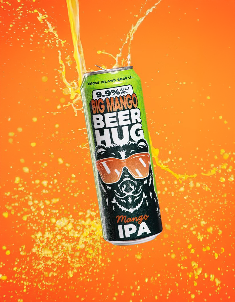
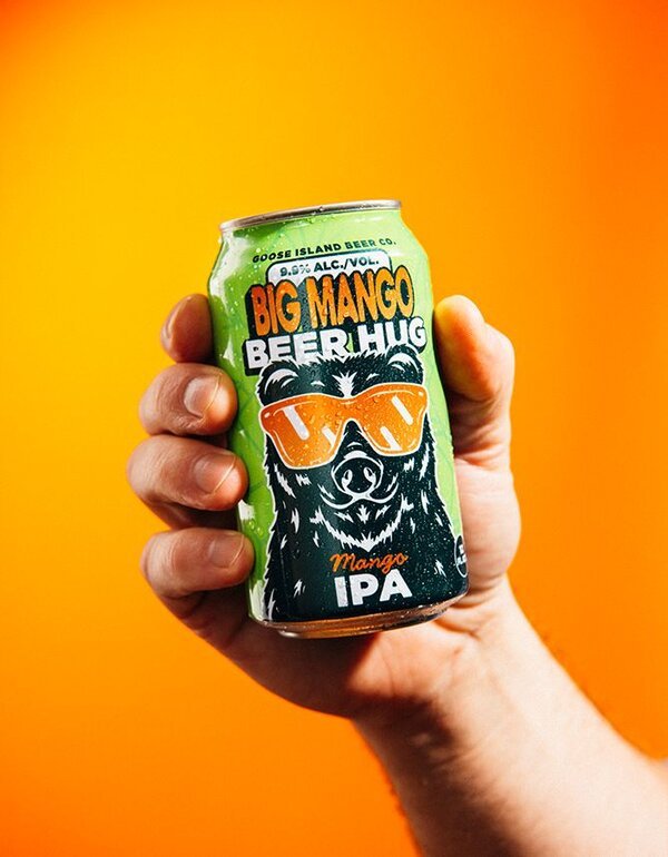
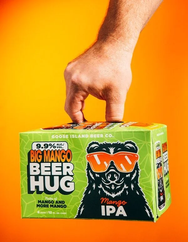
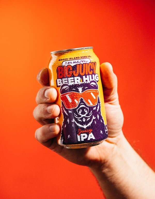
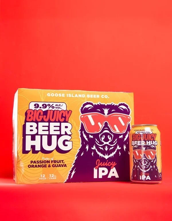
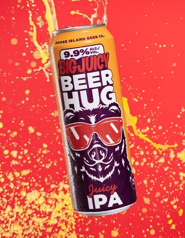
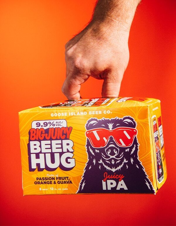
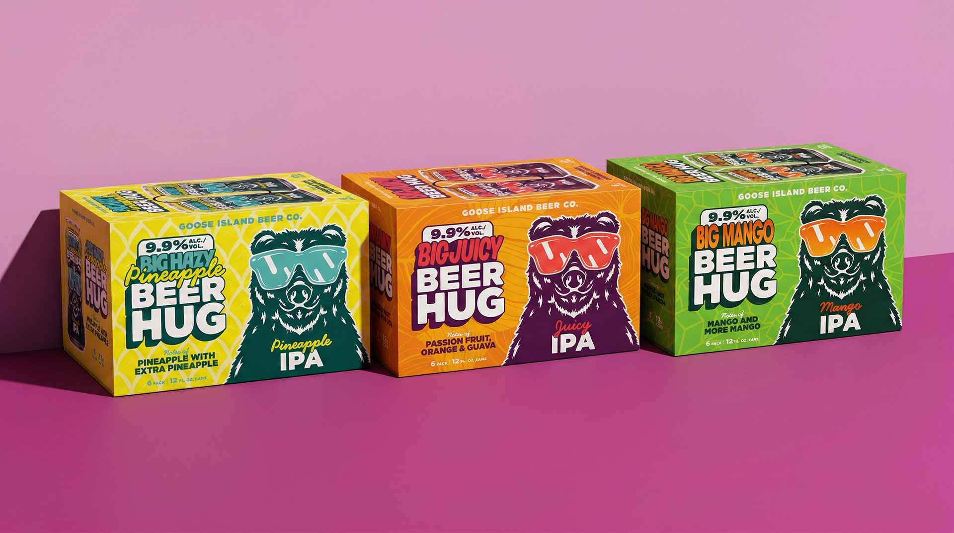
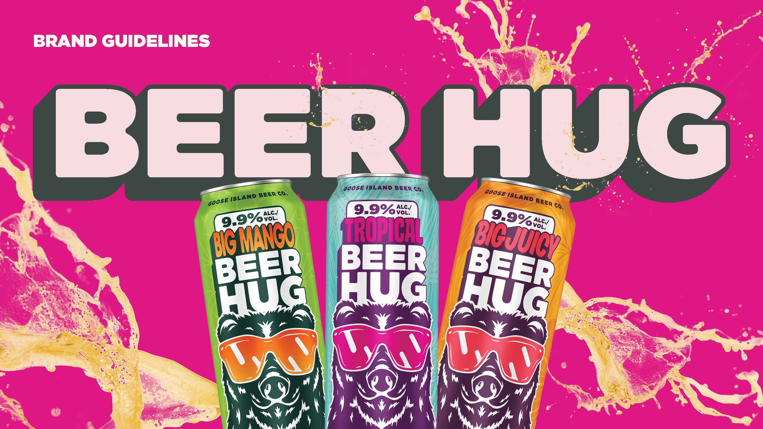
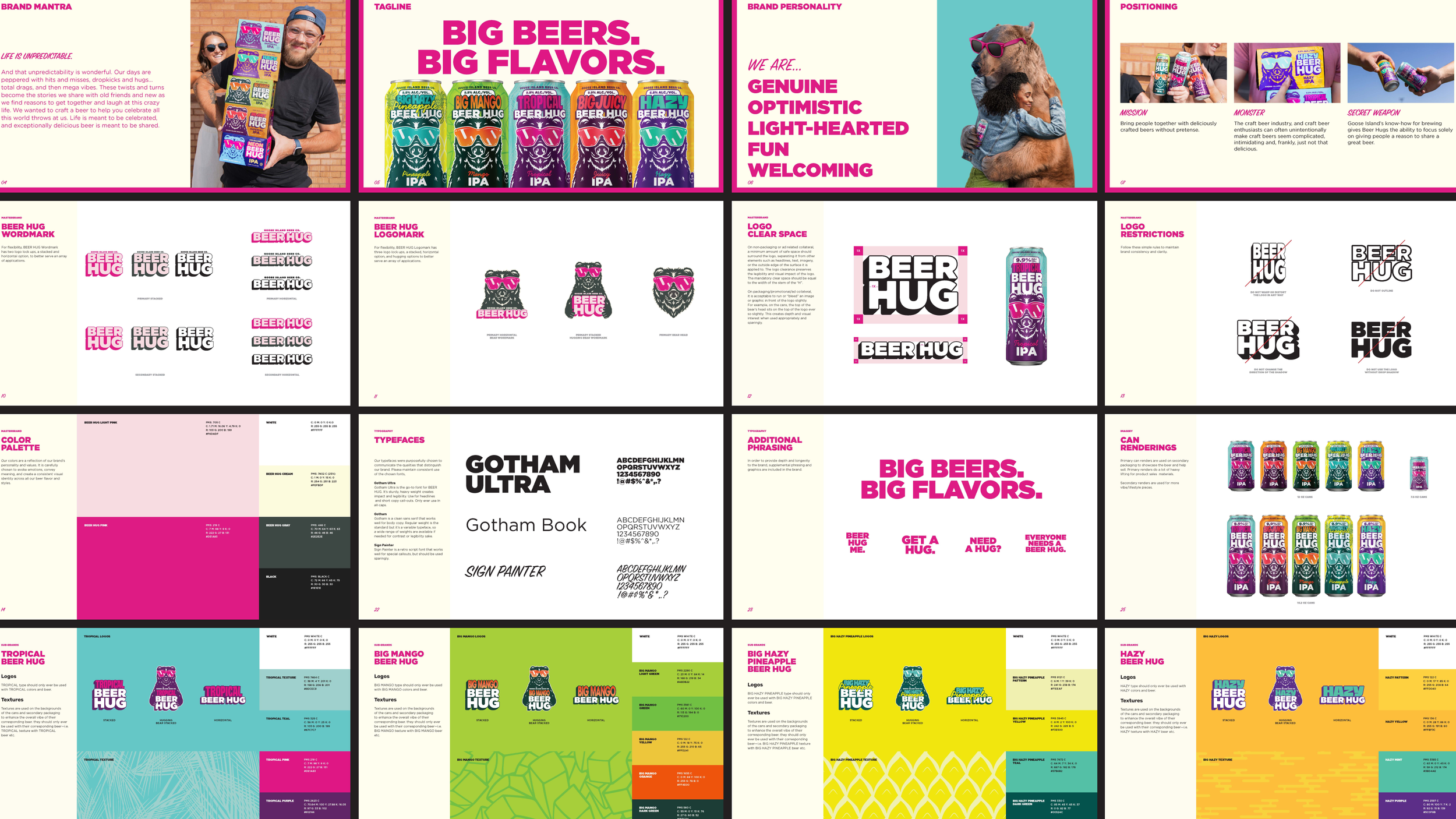
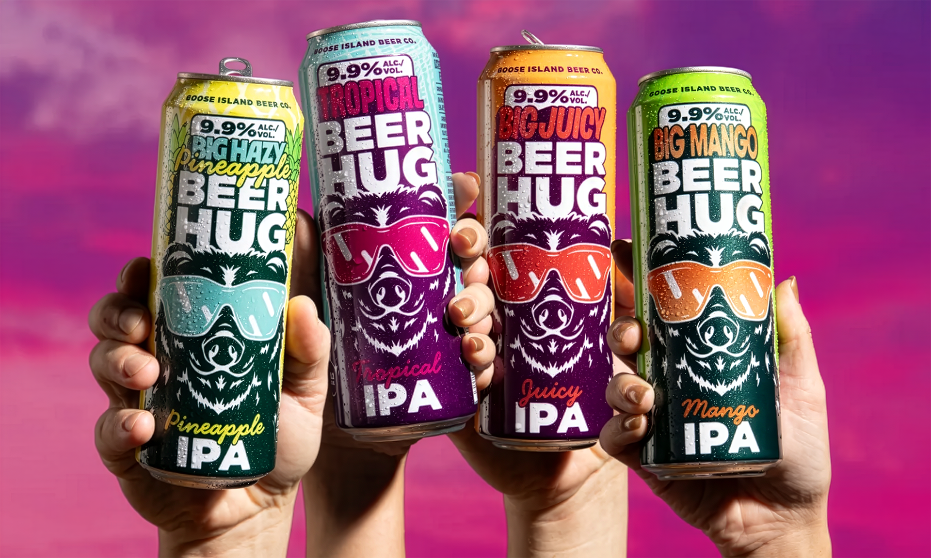
Packaging DesignAs Beer Hug continued to grow, Goose Island Beer Co. needed a cohesive design system that could scale across the brand. The existing packaging lacked consistency, and newly uncovered consumer insights called for clearer communication of key product attributes across both primary and secondary packaging.
We had to preserve the recognizable design that loyal consumers trusted while tightening and unifying the system across five SKUs, four can sizes, and three pack formats. This meant bringing greater discipline
to color usage, layout, and on-pack callouts without disrupting shelf recognition.
The new design system brought immediate clarity and consistency to the Beer Hug portfolio, strengthening brand recognition across formats while making key product information easier to navigate at shelf. Goose Island gained a flexible, future-proof packaging framework that supports continued line expansion without sacrificing visual equity.
Photography: Goose Island Beer Co.
Agency Partner: Stout Collective
View More Work
Crowns & Hops
Craft Beer For The Culture
Finch Beer Co.
Join The Flock